Player
Redesign Podcasting Experience to Drive Engagement
Led the end-to-end redesign to help listeners discover relevant content faster and improve playback controls for a more intuitive, multitasking-friendly experience with in-depth user survey and interviews
ROLE
Lead and Sr. Product Designer
TEAM
PM | Brand Designer
Engineering | Marketing | QA
DURATION
18 weeks
THE BUSINESS CHANLLENGE
MY RESPONSIBILITY
As a Senior Product Designer, I worked closely with PMs, Engineers, and Revenue teams to owned, redefined, and shipped key improvements across PlayerFM’s core podcasting experience.
Led the end-to-end redesign to optimize listener experience and an UI refresh with brand designer
Proactively identified high-level opportunities and brought clarity through storytelling and prototyping
Conducted rapid user research and testing to surface insights and support decision-making
Designed and iterated on high-fidelity mocks, key flows, and interactive prototypes
Collaborated on sprint planning and long-term roadmap definition
Aligned cross-functional stakeholders throughout the entire product cycle
PROBLEM
Before
We doesn’t know
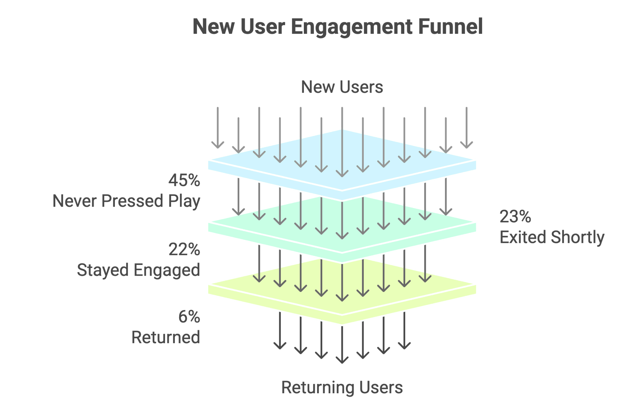
When we acquired the app, the product had no clear target audience. It designed to everyone which leads to usability issues across the app.
App doesn’t know
The app didn’t collect user preferences, relying on popularity for recommendations, resulting in irrelevant content.
User doesn’t know
85% of users multitask while listening — they want content that fits the moment, not specific topics.
User can’t find
Too many shows without thoughtful recommendation & unintuitive search made discovery overwhelming.
User can’t access
Key controls like playback speed were hidden, making quick adjustments frustrating.
User can’t decide
They want quick, low-effort decisions and don't want to read long descriptions.
Re-engagement falls short
Weak UX already hindered retention — burying notifications further reduced users’ likelihood to return.
HMW QUESTION
How might we help listeners discover right content faster and effortless?
I prioritized rapid user research to uncover user pain points with real context which helped clarify cross-functional teams on who we’re designing for, what problems we’re solving. And utilize rapid testing experiment to validate design solution.
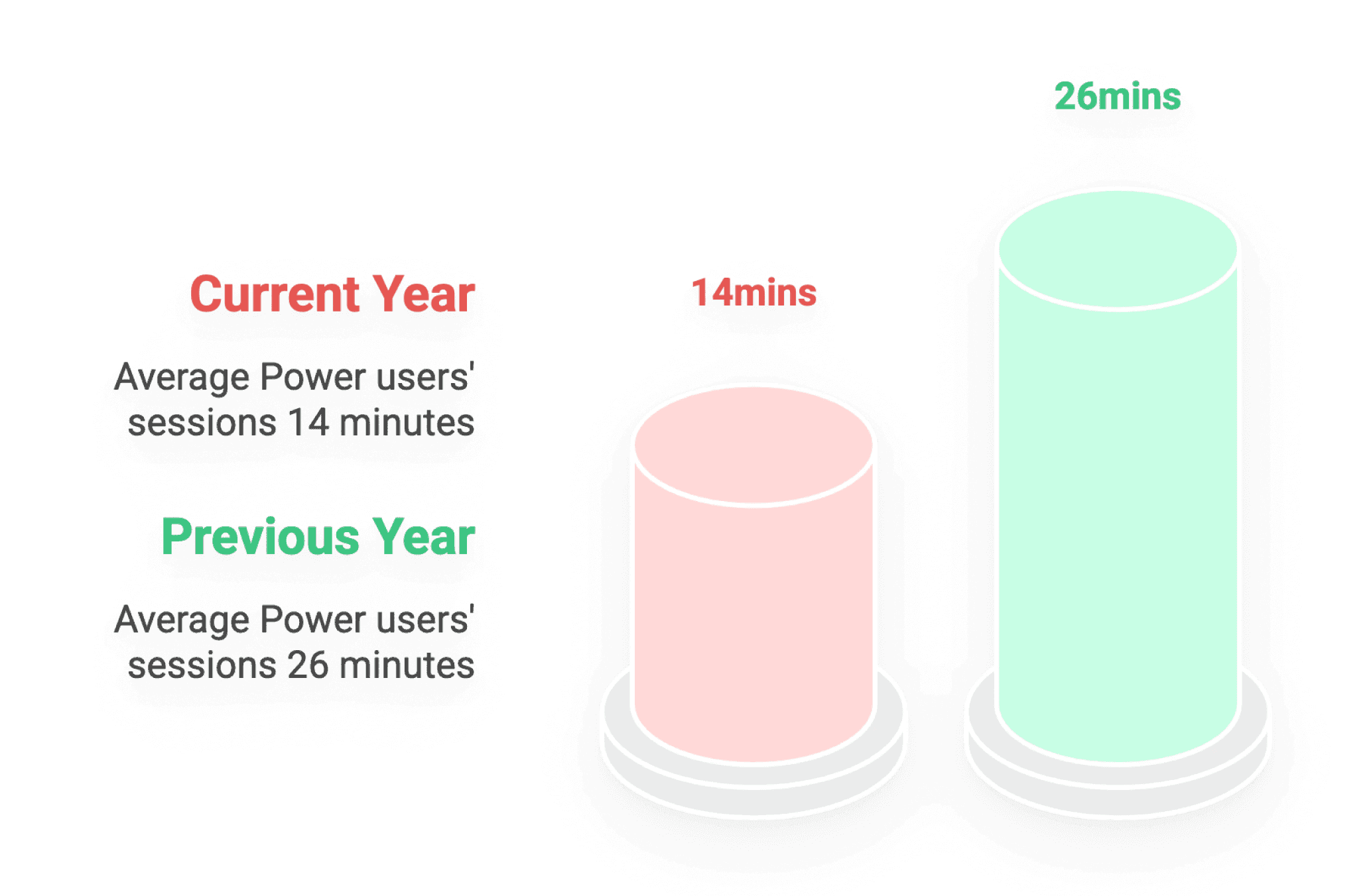
RESULT AFTER 2 MILESTORES & 6 FEATURES + UI REFRESH
62%
Session length
35%
Day-30 Retention
60%
Drop-off Rate
Before
After
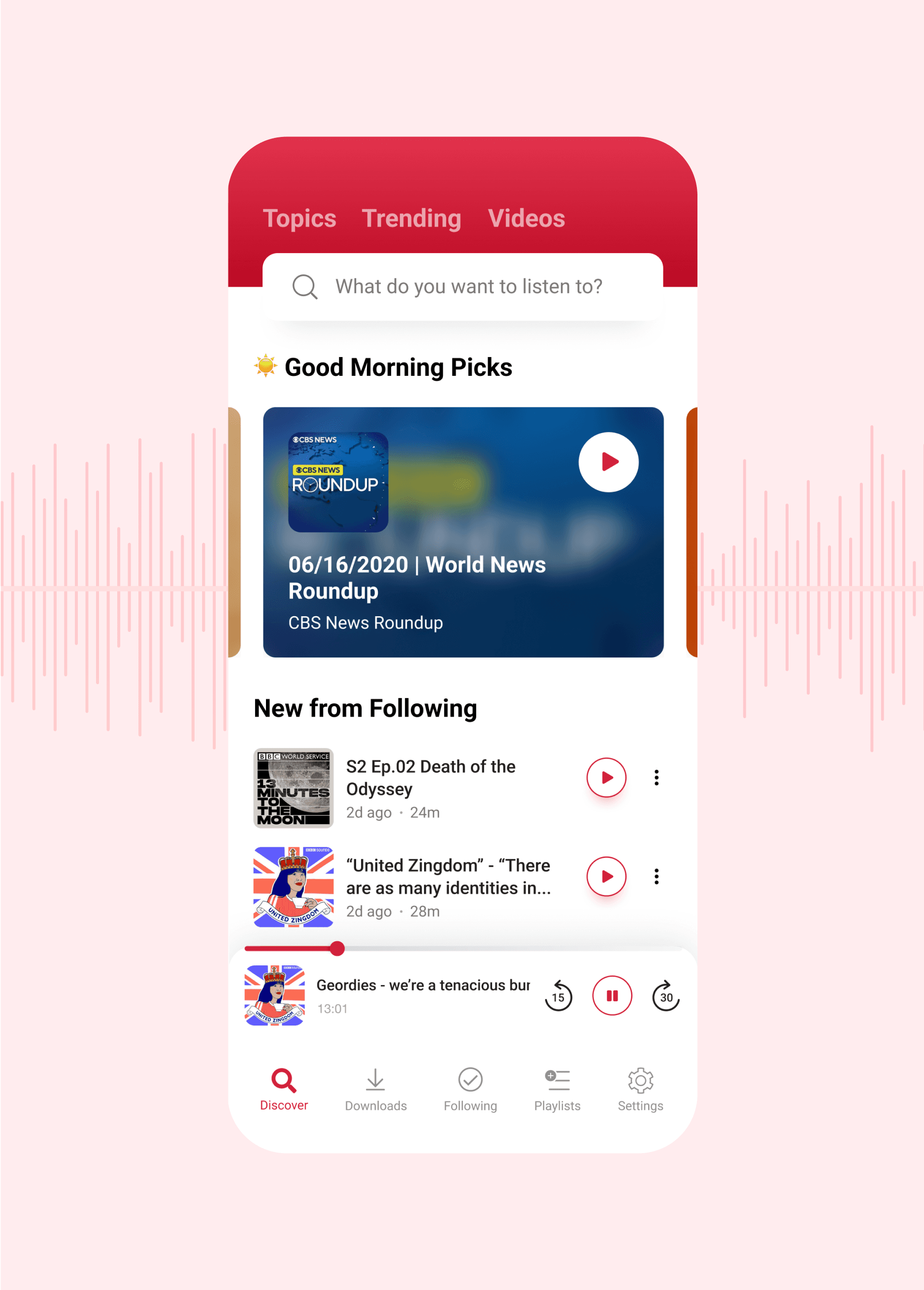
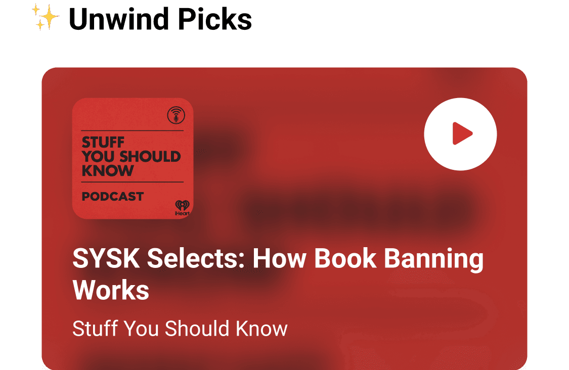
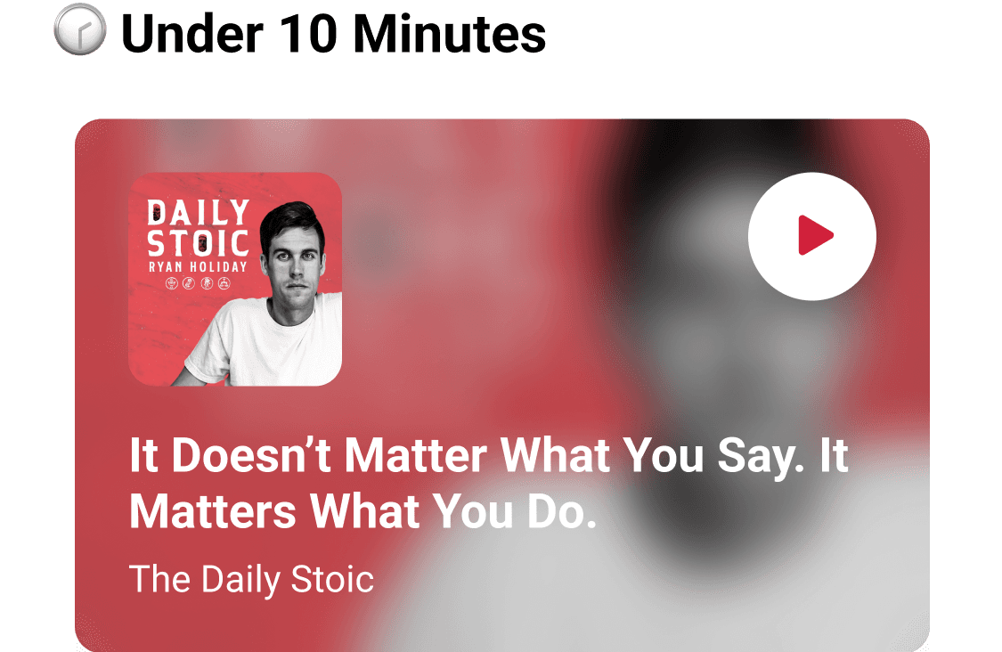
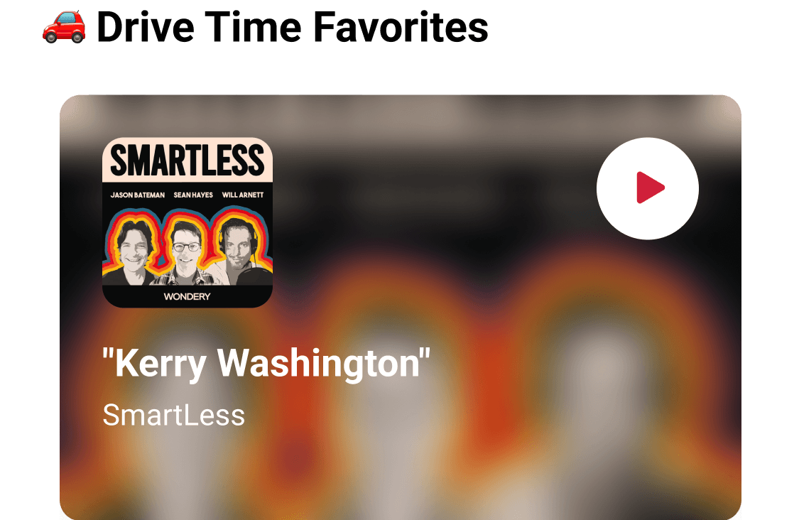
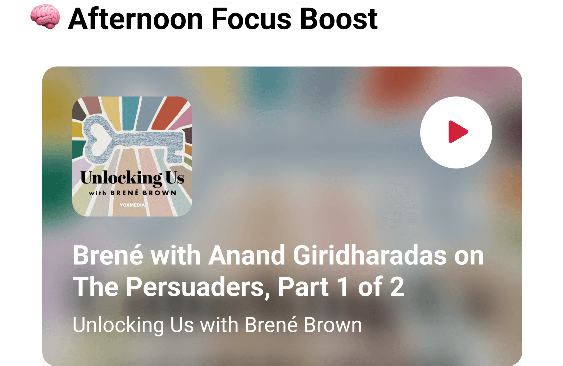
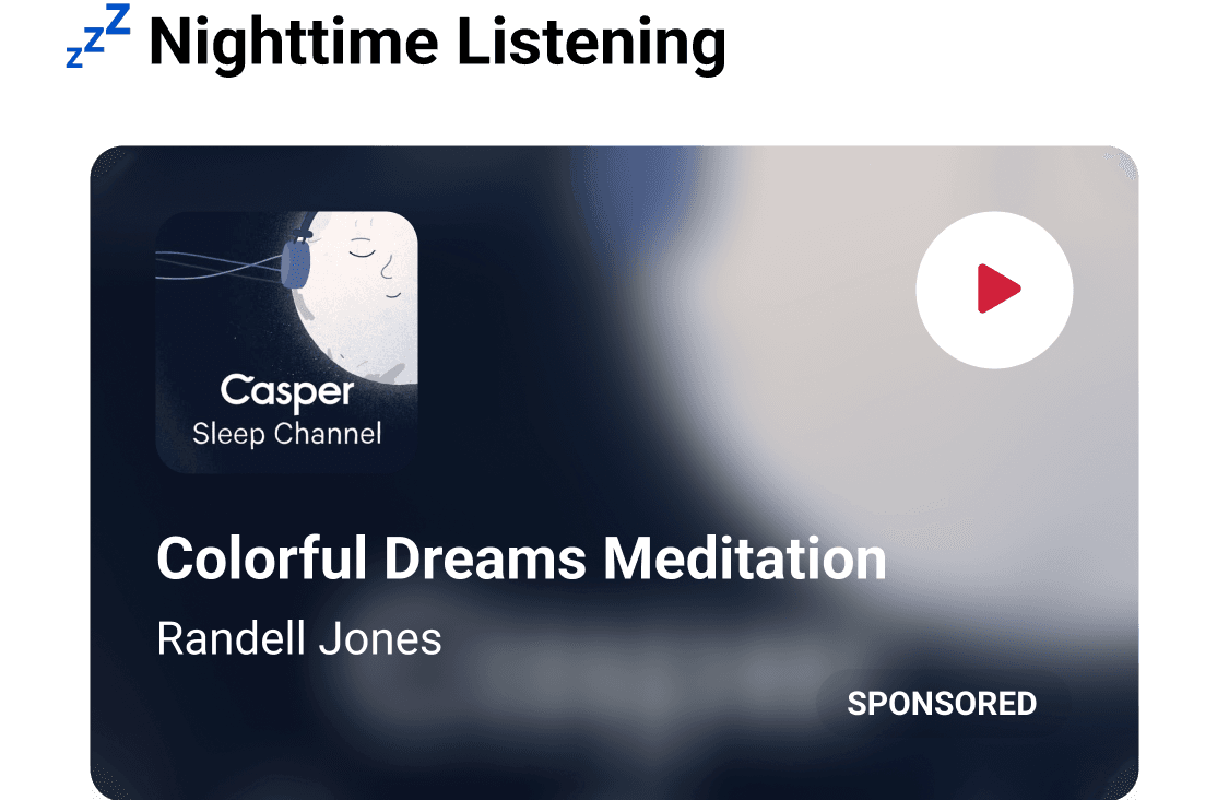
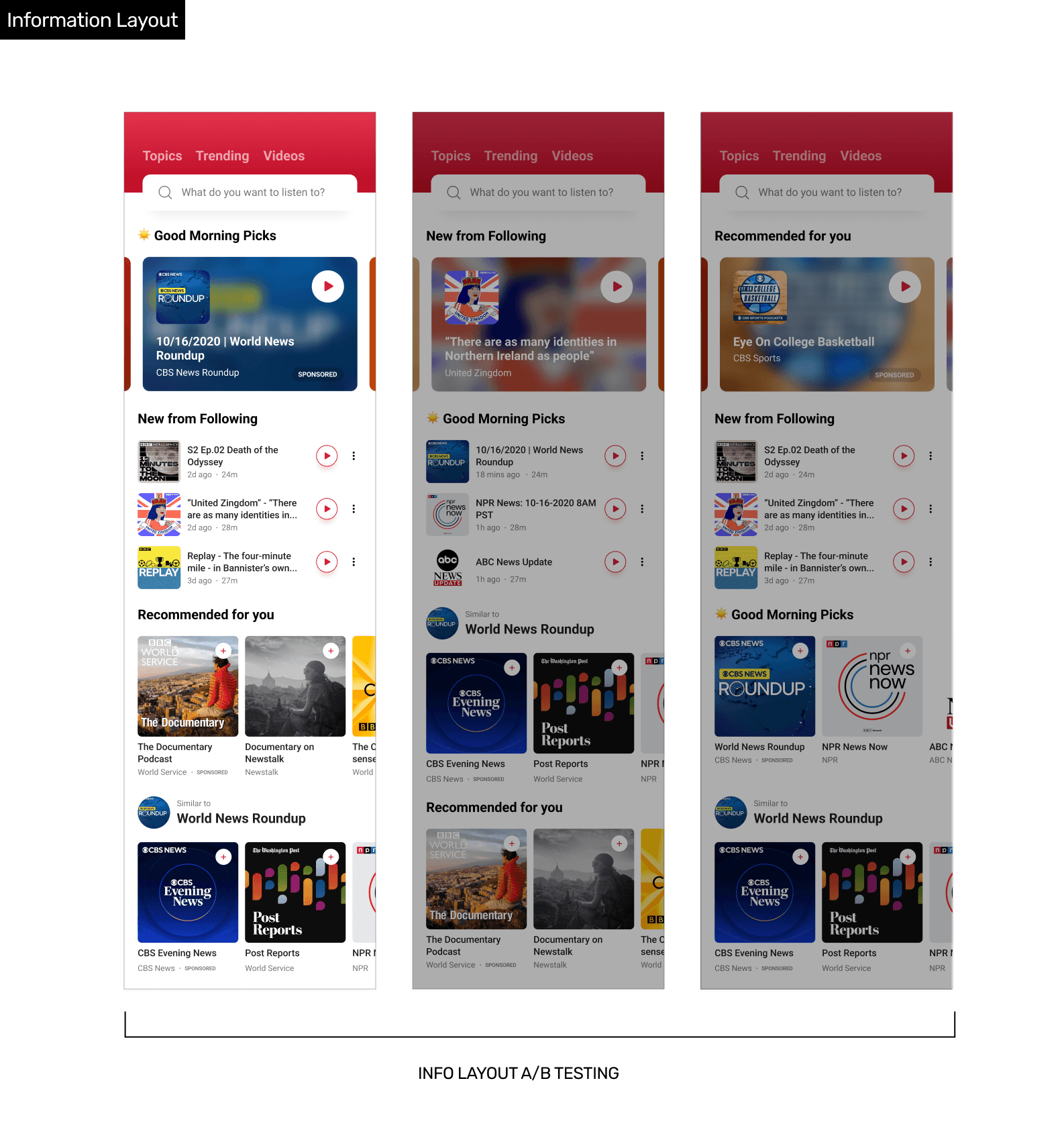
Personalized Discovery Feed for Effortless Content Matching
Dynamic home feed that surfaces content based on user behavior and time-of-day context, making it easier for users to find something to play without feeling overwhelmed.
PROTOTYPE FOR NOTICIFATION
PROCESS
Design fast, test smart, iterate with real feedback in a rapid agile environment under tight timeline & limited resource.
Discover from Data
By analyzing user behavior in Firebase with general observation for legacy app and gathering input from stakeholders, I identified several insights for user research and quick iteration.
Quick Wins
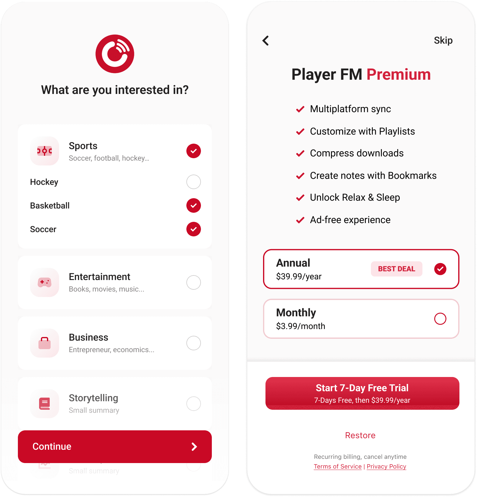
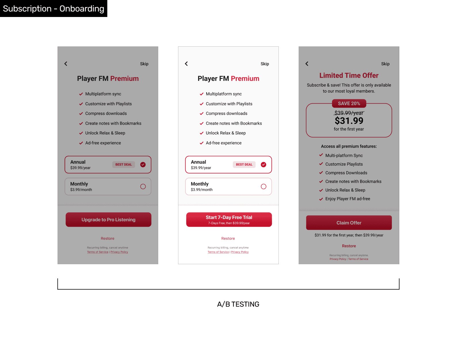
I redesigned the onboarding flow for early interests collection with skippable registration and discounted subscription offer for higher engagement.
User Survey & Interview
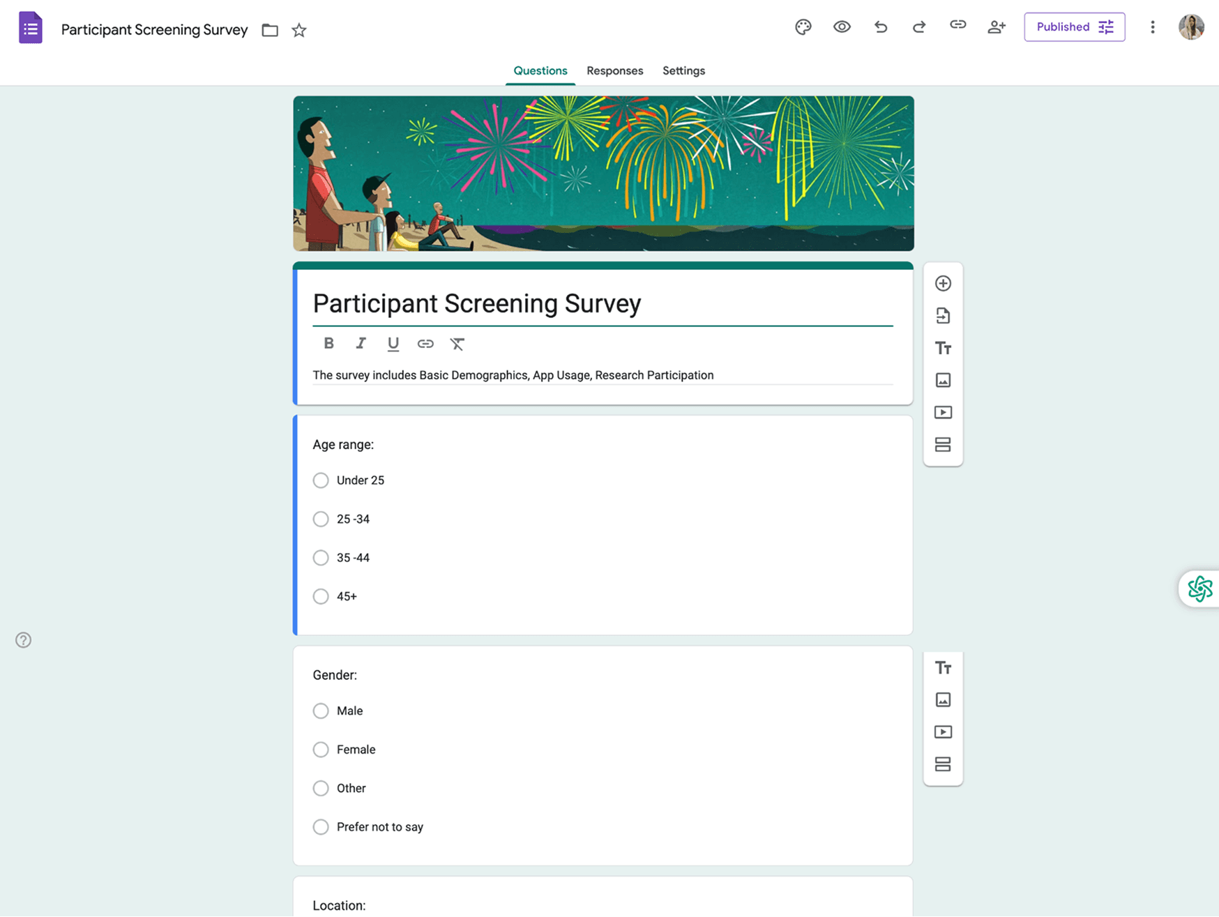
To understand user needs, I launched an in-app survey that revealed our most impactful insight: 85% of users listen while multitasking, they prefer familiar shows for a quicker, easier start over discovering something new.
I also led the company’s first user interview—despite initial constraints—which helped uncover deeper listening behaviors.
Deepened Understanding
Beyond the survey, interviews revealed that users aren’t searching for a specific topic—they’re looking for content that fits their context and mental capacity. At the same time, 30% users fear being stuck in a bubble of overly familiar content without exposure to new ones.
These insights shaped a more balanced, context-aware IA for discovery strategy through in-depth experiment.
Validate
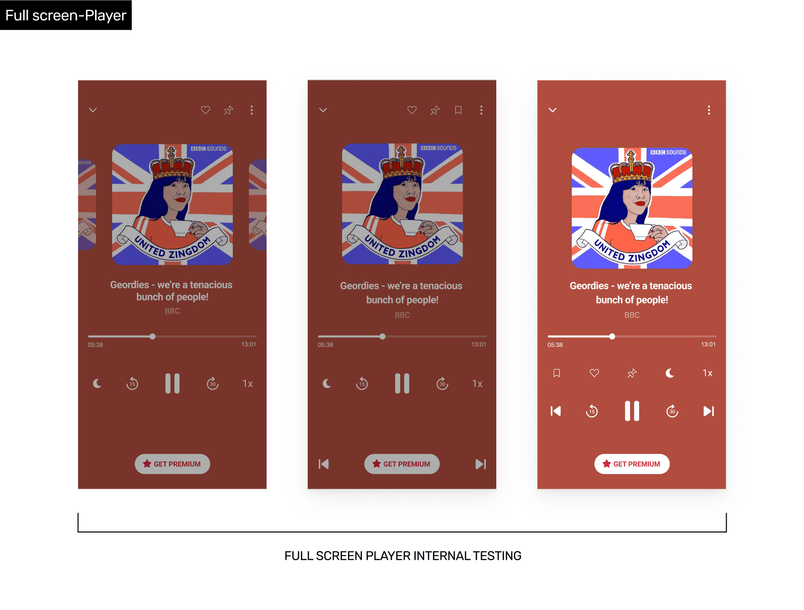
I utilized internal testing to quickly validate ideas with limited resources. We confirmed key features were effective.
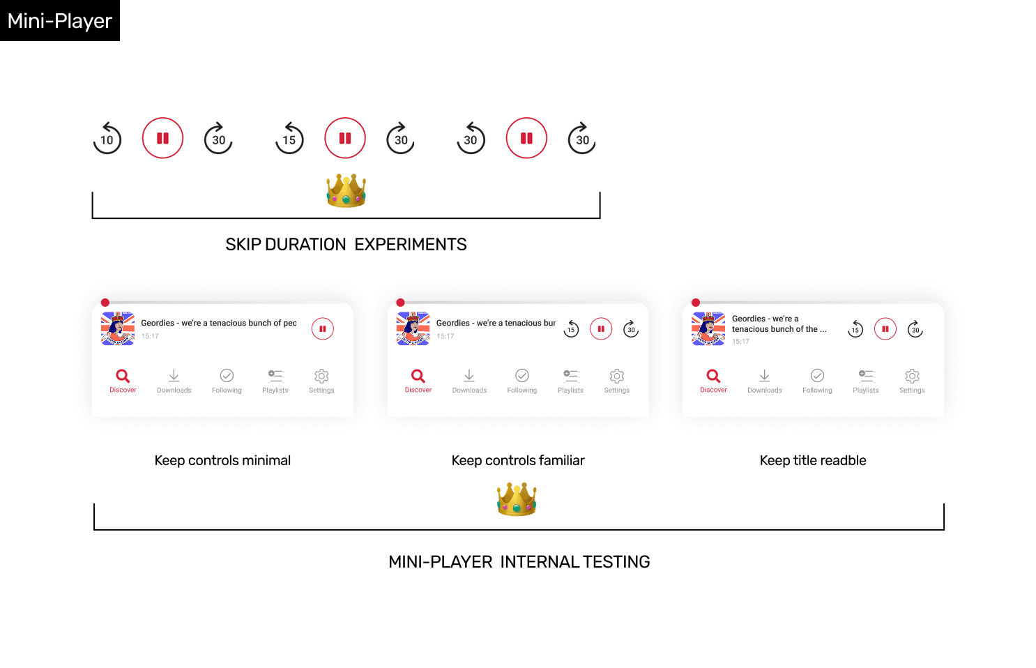
During player testing, I uncovered a key insight: the skip back control wasn’t just for missed content, but for resuming after interruptions. Based on this, I ran a quick experiment to identify the optimal skip-back duration that best supports real user behavior.
Post-release Testing & Monitoring
Given tight timelines, I collaborated with PMs to run post-launch A/B tests on design variation. Real-time data helped us iterate quickly and refine the experience.
MORE RELEASED FEATURES
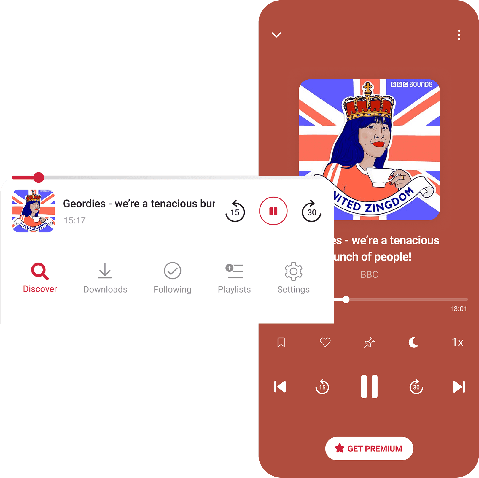
Intuitive Players
Optimized mini-player and full-player for multitasking use cases, surfacing the most-used controls and refining skip durations for better resume flow.
Onboarding for Better Recommendation & User Experience
Intentional onboarding with skippable registration & interest pickers. A/B tested subscription offer for user-centric experience.
Optimized the flow with soft-prompt which triggered by positive user actions — followed by personalized, non-intrusive notifications strategies.
90%
Opt-in Rate
75%
CTR for Notif
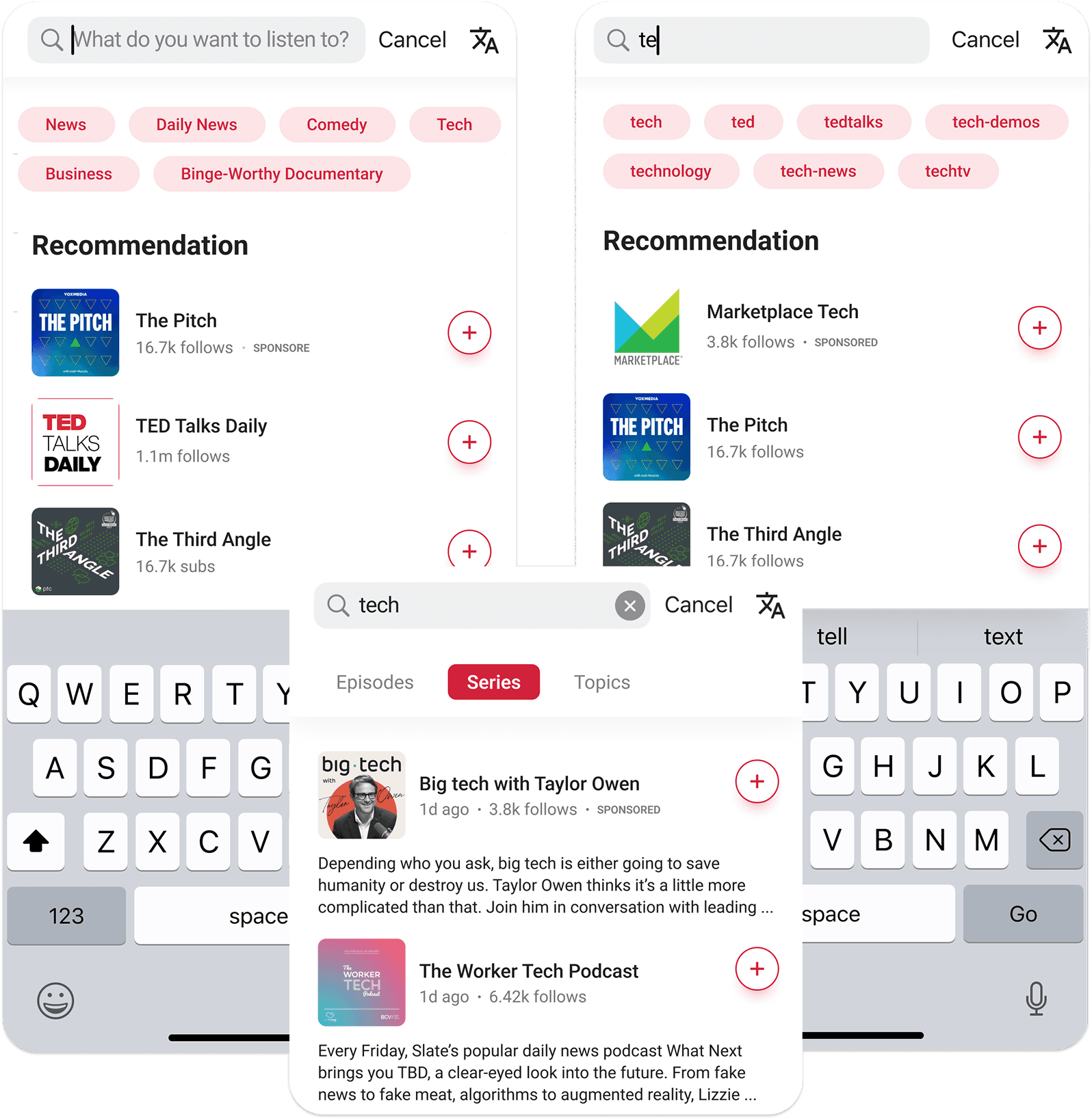
Redesigning Search to Boost Play Conversion
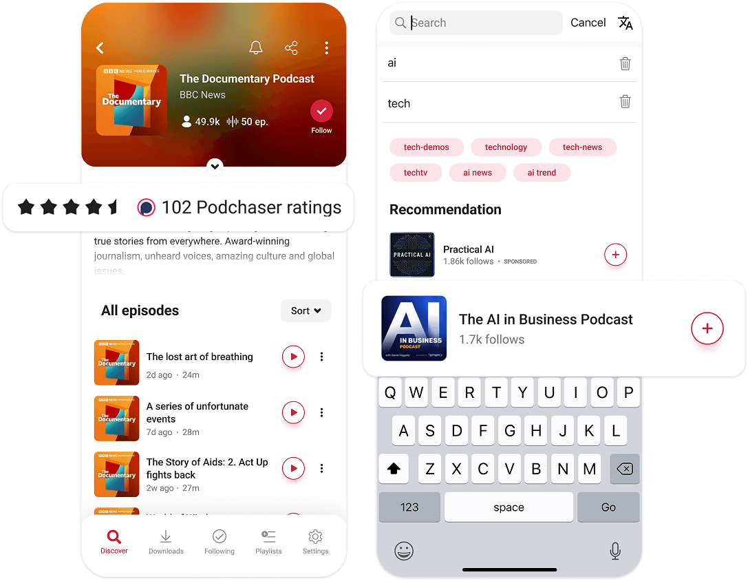
Optimized the search experience with real-time suggestions based on user history and trending content — while surfacing sponsored shows to increase visibility and tap-to-play conversion.
TCR
Leveraging Social Proof for Faster Decisions
Surfaced key metadata — ratings on series pages and follower counts in search results — to give users social proof and reduce hesitation, helping them decide what to play, faster.
KEY LEARNING
Design Fast, Test Smart
Testing isn’t about doing more — it’s about doing it right.
With tight timelines, we adapted rather than skipped testing. During design, we ran quick validations: internal reviews, TestFlight usability checks.
Post-launch, we used A/B testing to learn from real user behavior and optimize fast.
Full Deck
Curious about the twists and behind-the-scenes stories from development? I’d love to share more in my case study presentation.
See Full Deck

